6 Bathroom Colors Taking Over in 2027 (Spoiler: It's Not White)
Disclosure: Redesign may receive a small affiliate commission from purchases made via links in this article but at no cost to you.
by Dev Malhotra • Mar 13, 2026 • 3 min read
Disclosure: Redesign may receive a small affiliate commission from purchases made via links in this article but at no cost to you.
by Dev Malhotra • Mar 13, 2026 • 3 min read
The 2027 Colors of the Year are rolling in.
Not one of them is white.
There is a decisive move away from stark whites and cool grays toward warmer, earthier hues, and here's how that shift is landing in the bathroom.
Sherwin-Williams and HGTV Home jointly named Celery SW 6421 their 2027 Color of the Year, calling it a "tinted neutral" that blends khaki, butter yellow, and sage.
It's already proving itself in bathrooms: designer Gianpiero Gaglione used it on traditional wainscoting in a Laurel Canyon bungalow bath, and Sherwin-Williams color marketing manager Ashley Banbury suggests a bathroom vanity as a low-commitment way to try it.
Pair Celery with aged brass or bronze hardware, which brings out its yellow undertone, and add oak or handmade tile for warmth. Skip cool chrome and stark white tile, which can tip it toward the "hospital walls" look some critics on social media have already called out.
Behr's Grounded is an olive with subtle brown undertones that can read as olive or moss depending on the light. Designer Carrie Senft calls it a "Goldilocks" olive, neither too yellow nor too blue.
And these picks do translate into real sales: Behr's 2026 choice, Hidden Gem, was the top-selling non-neutral paint color in 31 states earlier this year.
Because Grounded shifts with light, paint a large sample next to your vanity and check it morning and night before committing. Designer Peti Lau pictures it alongside crema marble in a kitchen, and that same pairing works on a stone-topped vanity.
Valspar's Cottage Door 8004-38E is a powder blue with gray undertones that sits right in the middle of light and dark, warm and cool.
Blue bathrooms are also moving past seashell clichés toward full-room drenching with cream tile and antique wood accessories.
Drenching a bathroom means one color on walls, trim, and ceiling, but the sheen still has to match the room's moisture. Use satin or semi-gloss in bathrooms with a shower or tub; eggshell can be enough in a powder room without one.
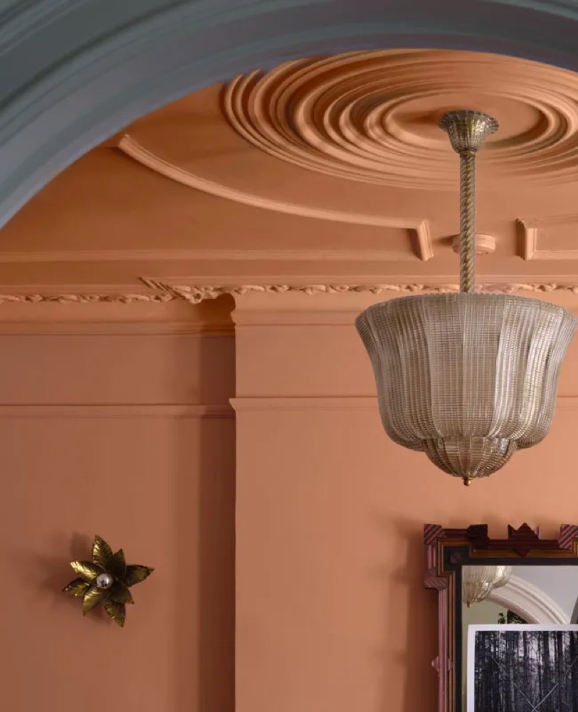
Graham & Brown's Rose Earth is a dusty pink with faded terracotta and plaster notes that behaves more like beige than bubblegum.
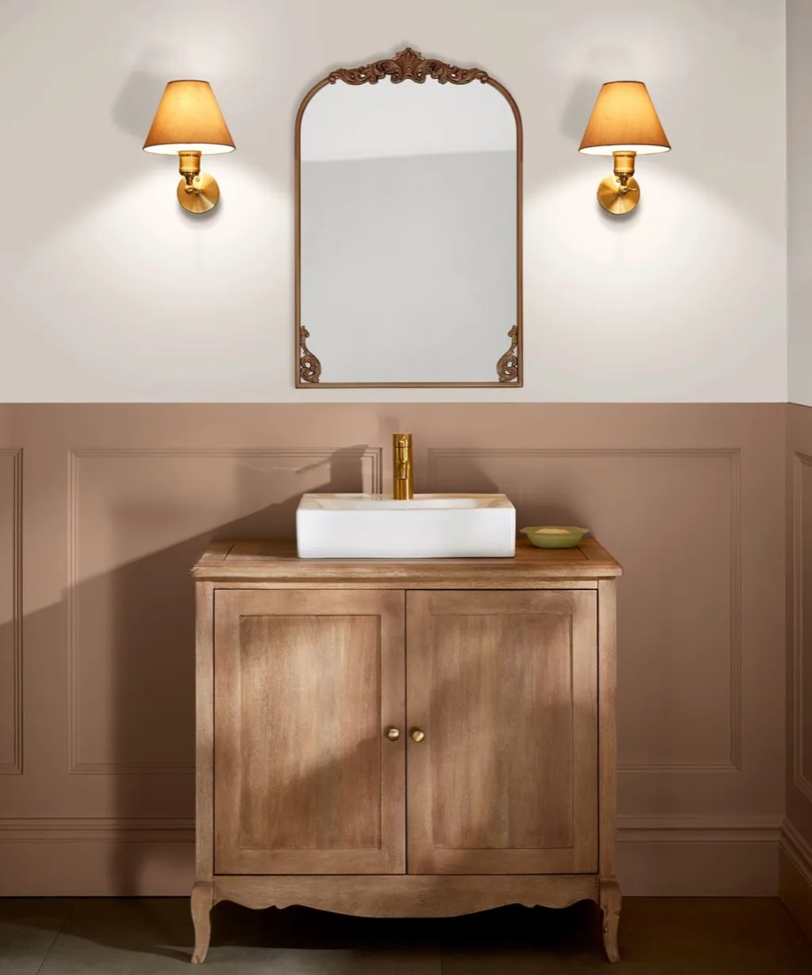
Designer Hallie Malitsk of Hallie Rose Design is betting on peach-leaning pinks such as Benjamin Moore Odessa Pink, pointing out that the peach undertone flatters a wide range of wood tones.
To keep pink grown-up, choose a shade with a clay or peach base rather than a cool, blue-based pink, and anchor it with a wood vanity or framed mirror. That's the combination Malitsk singles out for staying power.
Dutch Boy's Deep Rooted is a mid-toned terracotta, while PPG's Country Soil blends beige, taupe, and gray in a hue inspired by clay-rich earth.
PPG's forecast describes a shift from 2026's bright, expressive hues toward more muted palettes.
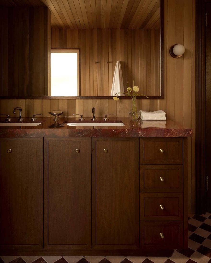
For a moodier take, Dunn-Edwards' French Press Coffee is a deep brown with a plum undertone that pairs with aged brass and honed marble.
PPG recommends running Country Soil across walls, trim, and ceiling for an immersive effect. In a small bathroom, that also means no fussy cutting-in between two colors.
John Maloney McNamara of Coosa predicts purple "in its darkest mood" for 2027, and he says a lacquered plum powder room gives your mirror reflection a flattering boost thanks to purple's warm undertones.
Among his picks is Benjamin Moore Plum Martini.
Lacquer-level gloss shows every dent and patch, so walls need to be smooth before you start. If yours aren't, step down to semi-gloss, which reflects less light than high-gloss and is more forgiving.
The common thread in 2027's bathroom colors is an earthy undertone, whether it's the yellow in Celery, the brown in Grounded, or the clay in Rose Earth.
If you're nervous about commitment, designer Michelle Murphy's rule is a smart one: try trend colors on easy-to-change spaces like a powder room and save permanent surfaces for deeper, more muted versions.
Test in your own light, match the sheen to the steam, and white can finally take a year off.